Context
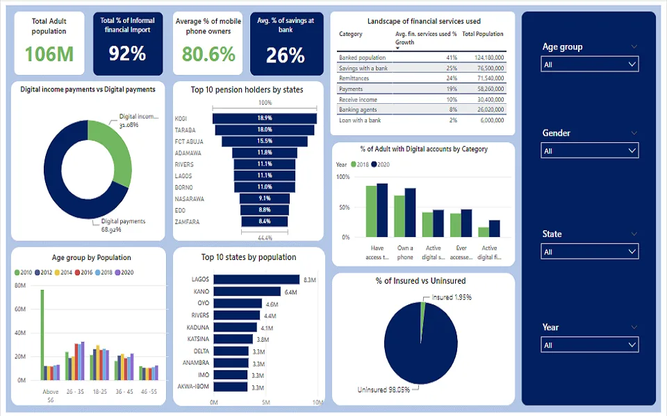
The project used two datasets and accompanying metadata covering age, gender, geographic zones, settlement type, population, mobile access, and financial-service indicators. The aim was to turn a broad information pack into a navigable view of inclusion.
Analysis lens
I structured the report to compare participation and access across demographic groups, locations, and survey years. Among the patterns surfaced, Kogi recorded the highest share of pensioners at 18%, while reported access to a mobile phone—owned or borrowed—was 85% in 2018 and 89% in 2020.
Decision value
The dashboard brought multiple inclusion measures into one view so analysts could identify gaps, compare population segments, and prioritise questions for deeper investigation. It is presented here as earlier work: a foundation for the stronger decision framing, transparency, and interpretation evident in my current projects.